Saturday, 28 March 2015
Thursday, 26 March 2015
Final Advert Print/ 1st Draft Compasion
Draft 1-

Final Advert Print-

From the overall improvements made I feel the critical acclaim stands out and matches the conventions of a farming documentary giving the main picture more of an attraction, drawing audiences in and giving them more information about the film. The conventional green colours help the audience to connect with the overall farming and earthly atmosphere and showing the farming location. The ident of channel 4d makes the advert more realistic for the audience and connects to the conventions of a documentary with the ident being well known for creating documentary shorts for audiences, instantly allowing the audience to establish the genre just from the small information. The typography added allows the audience to understand a clear date of when the film is released and where helping them to understand where to view and when, encouraging them to watch it. The draft one was to brief and didn't give enough information to the audiences to make it easy to establish how to watch the film, making them less excited to watch the film.
Editing: Changing Critcal Acclaim- Advert
 From my feedback of changing the critical acclaim to stop the look of unedited and just added. Allowing the audience to connect with the genre of farming life looking at the location and main focus picture that draws the audience in further to the beauty and hard work of farming life.
 In order to remove the dark unconventional background on the critical acclaim I had to go on photoshop and use the Magic wand tool to remove the background. Zooming in to the detail helped to ensure I got all the background off to gain a clear finish and look professional for the audience. I had to zoom out a few times to ensure the background was clear and neat for the audience.
Editing: Final draft 1- Advert (Feedback)
picture-------------
I love the layout of this advert as its clear for the audience to understand and imagine a message and understand the importance of the advert to sell the film to the audiences. The text I copied from the actual film where I enlarged and put in the corner to allow the audience to connect with the main focus picture and the title of "Farmlife" making the audience focus on the picture but still clearly see the title. The critical acclaim has been added at the top to allow the audience to connect with the success and high quality of the film, encouraging them to watch the film.
Feedback-
From my overall feedback I gained, I need to make changes such as ensure the background of the critical acclaim blends in with the backdrop of the main focus picture and doesn't show any black background as it looks over edited and just added on. I don't want the audience to become drawn to the critical acclaim more than the main focus picture, allowing the audience to understand the location and character connecting to the genre and traits of farming life. The colours matches the genre and characteristics of a farming documentary, linking to the earthy and pure like presents, drawing the audience in and creating more interest to watch the short. The ident in the corner in small yet clear and helps the audience to understand who disputed the film, connecting to the type of films channel 4 produce, specializing on documentaries.
Editing: Ancillary product- advert: Critical Acclaim
I wanted to match the conventions of an advert for a film by adding crital acclaim. Not only does this encourage the audiences to view the film but it shows the success in the film, showing the high standard and quality, drawing the audiences in.
I found this picture on Google images, The information about the film isn't important but the critical acclaim at the top really appealed to me as the layout draws viewers in and links to the idea of showing the important information to the audiences clearly. I cropped the acclaim down to hide the rest of the poster and to only show the important acclaim to the audiences. I want to include this in my advert as I felt it would draw the audiences in and encourage them to watch the film.


Editing: Choosen Still for Acelleriy Product- advert

I decided to choose this still because I felt it connected with the conventions of a farming documentary from the location and the mise es scene of the stereotypical features audience can relate to found on a farm. The colours draw the audience in with the depth of field being deep from a small aperture the dark detailed colours encourage the audience to watch the short as it gives more information about the location and surroundings.
Final Double Page Spread/ 1st Draft Comparsion (Feedback)
Before- (Draft 1)

After- (Final Product)

By listening to the last feedback of my draft I have produced a final ancillary product to clearly advertise and attract audiences to watch my Short. I enlarged the title to standout to viewers and clearly address the audience, encouraging them to watch the short. By deleting the text of 'coming to a cinema near you' helps the audience to become more understanding of where to view the short and see where its distributed. The critical acclaim helps the audience to see the success of the short encouraging them to watch it. Having it in the bottom corner doesn't draw the audience attention from the titles and the main picture, creating interest and connecting to the genre of Farming documentary. The background blends in and doesn't have black around, making it look over edited and unprofessional. By adding text on the right allows the audience to gain more information about the short and gets them more involved with the narrative. Giving them not only a visual look from the picture but information to backup the main focus, making them understand facts and stats on Farming life, giving them more of an insight.
Feedback on Final Product-
From my overall feedback audiences are much happier with my results and understand where to view the short. The layout is clear and connects with showing the genre of farming to the audience not only through the colours of natural earthy themes such as greens and blues but through the style of font connecting the viewers to the message of farming.
Editing: Double Page Spread- Changing critcal acclaim- Award Winning

I found this critically acclaimed picture on Google images to edit in Photoshop to match the conventions of a farming documentary I wanted to ensure its in the same colour as my newspaper. I saved the picture to my settings and opened it up in Photoshop.


I moved the critical acclaim to the bottom right hand corner as I felt it was losing the main focus of the double page spread, the background has been removed as it looks less edited and more professional to the audience. The move allows the audience to see more of the double page spread and understand the location more, linking to the genre and idea of farming traits.
Saturday, 21 March 2015
Editing: Double Page Spread- Final draft 1 (Feedback)
This is my final draft of my newspaper, I love the colour and the clear focused picture, showing the audience the location and connecting with the main character. Also linking to the connections of genre and farming documentary from the green colours and the country style font shown.
Feedback-
Katie- The text of 'coming to a cinema near you' implies that the advertisement is for a trailer, giving the audience a wrong message and confusing them on thinking its a trailer. Due to the fact the advertisement is for a Short Film the text shown state a date when the short will be shown on the chosen distributor channel, Channel 4. I love the colours as they show a realistic trait of farm life and connect with the genre of Documentary.
Jade- The text is confusing and makes the audience think the advertisement is for a Trailer not a Short, however I love the critical acclaim as it shows the audience the popularity and allows the audience to see awards that the Short have won, creating interest and encourage audiences to view the film . Maybe change the background to clear to hind the black drop as it creates an unrealistic add and shown its clearly been edited, doesn't blend in to the conventional colours.
Megan- I love the main focus picture as I feel it draws the audience into the film and encourages them to watch it. The main picture allows the audience to become connected and understand the mise en scent of the character perhaps connecting to the storyline and narrative of the short. Have you thought about changing the text at the bottom as it doesn't connect with an idea of advertising an short.
Overall action next-
From the clear feedback given I will acted upon changing the text to match the conventions of advertising a short and allow the audience to instantly connect with the advertisement, by changing the text to a channel 4 distributor instead of viewing at the cinema but also giving a date and time to view the Short, making it clear for the audience. I will change the background on the critical acclaim to blend into the background and not look over edited for the audience, making them see the realistic side of the advertisement and professionalism. I will keep the main picture and colour the same as its conventional and allows the audience to connect with the location and main character, encouraging them to watch the Short.
Friday, 20 March 2015
Editing: Double Page Spread- adding Ident
Channel 4 Ident-
Channel 4/4D is known for creating shorts and documentaries for the audiences. I felt it matched the conventions of our short and was a realistic company to choose to dispute our short, instantly allowing the audience to see that the product is a short and a documentary just from the ident. I found the Ident from Google images Channel 4, I selected this style ident from the other choices because I felt it matched the conventions of a Farming documentary with pure and natural colours, blending well with my background colours, standing out yet not drawing the attention from the main focus of the double page which is the main picture.
After previously researching into Channel 4 ident. I decided to put the ident on my double page spread as it allows the audience to see the distributor of the Short and helps them to connect with the type of films they have produced linking to documentaries and specializing in Shorts. I found this Ident on the Channel 4 website where I then copied it into my double page spread to show the audience who distributed the short.


Editing: Double Page Spread- Adding Text and Picture

Production:Final Main Focus Picture- Double Page Spread
This picture was taken on a Nikon EOS DSLR camera with no filter, Manual mode and a shallow depth of field. When capturing this picture I had to adjust the shutter and aperture to ensure the exposure and depth of field was correct. I wanted the audience to become connected with the main focus of the picture, which is the Farmer character. Connecting the audience with the mise en scene of the Farmer and the conventions that fit with the idea of Farming Documentary, allowing the audience to see the link with the sheep and farmer, perhaps stereotypically showing the relationship between farmer and sheep. I feel this picture will fit perfectly with my main focus picture in my double page spread as it links to the conventions of farming and gives more information to the audience about the location; being rural, instantly connecting to farming and the mise es scene; the sheep and the stereotypical farmer clothes following the traditional traits of a Farmer.

Production: Chosen Stills for Double page spread
Due to being an A-level Photography student I was able to capture picture at our location to use for ancillary products. This allows the audience to connect with the genre and theme of Farming. This allows my ancillary products to hit a high standard linking to my intentions of matching my target audience of young adults and appealing to them. The stills below are some examples of my favorite stills to use for my double page spread and advert. I feel they are effective towards the audience as their conventional to the theme of Farming Documentary. Looking at a range of different pictures helps me select my final main focus for my double page spread.


Thursday, 19 March 2015
Research: Anceillery Products- Double page spread research
I decided to look into different double page spreads to help me match the conventions of a double page spread and link to my genre of Farming documentary, instantly connecting the audience with my short and helping me understand a layout.

 Looking at a range of different double page spreads helps me to understand the types of layout I can include and help me with the initial production side of the product. I want the audience to feel connected with the film and understand the genre of Farming documentary, linking to the connections of the storyline and helps to encourage the audience to watch the film. The double pages I looked at link to the idea of clear and structured layouts to clear show the main focus to the audience. Telling them about the location and the perspective genre of the film, giving them more information before watching the short. Most double page spreads have a section for text and then a main focus picture to allow the audience to have the informal information but also the versil image on the page. understanding the main focus of the short and the genre. Some are more complex than others, showing the audience more focus images and main information which I find hard to view as the audience want an instant quick viewing where they can establish the genre and short easier. I want to make my double page spread easy for the audience to view and understand the main focus and information before watching the short, creating interest and encourages them to view the short. I feel the colour is a huge impact on creating interest with the audience as it needs to be bright to catch the audience eye but also match the conventions of a Farming style documentary.
Research: Ancillary Products- Double page newspaper spread (Genre conventions)
I researched into different layouts which was conventional for following the traits of a Farming documentary that links to the stereotypical links to farming and where the audience can relate to a meaning, gaining more information about the film;


The layout shows an earthy and pure feel linking to the genre of Farming and instantly linking the audience to the stereotypical farming location and earthy present. The colours of green and brown show a connection to the genre and linking to an natural feel where the audience can relate to a farm.


The layout shows an earthy and pure feel linking to the genre of Farming and instantly linking the audience to the stereotypical farming location and earthy present. The colours of green and brown show a connection to the genre and linking to an natural feel where the audience can relate to a farm.
This layout is conventional for a farming documentary as it links to the genre due to the bold pictures showing an importance for the audience and allowing them to see a connection to the location which is shown on the film, allowing the audience to gain more information about the film and become more interested in the film.
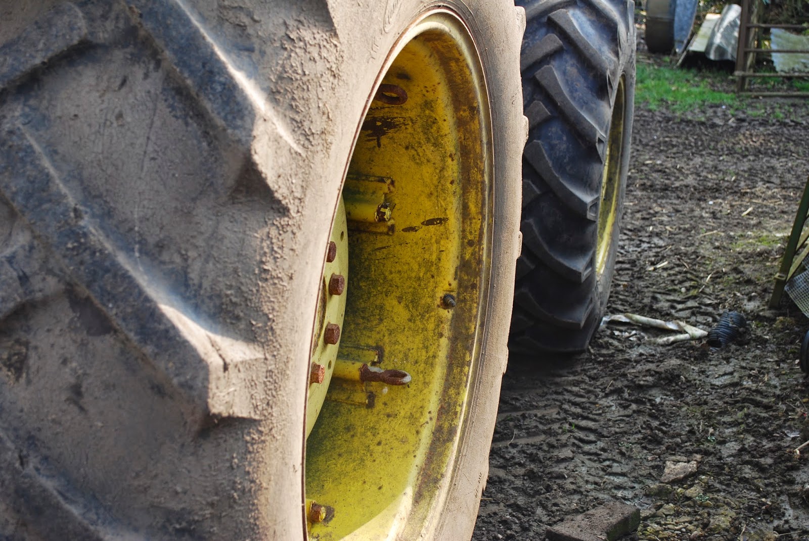
This layout matches the conventions of a farming documentary due to the bright bold picture allowing the audience to gain information from the picture of the location and stereotypical farm location, due to the main focus being the Tractor. This instantly allows the audience to see the genre and the connections with the genre. The element of the Tractor instantly shows the audience the relation to farming and the stereotypical traits farmer's follow.
Wednesday, 11 March 2015
Research: Ancillary Products- Layout
Image on the left page and text on the right-

This layout helps the audience to connect with the main image creating interest with the audience as it separates the text from the picture. The picture on the left instantly draws the audience in to the film information and tells them more about the characters. The text is presented in communs in a newspaper style and clearly makes the audience see the clear layout and understand the information more with the clear, neat layout, attracting the audience with the bold font selected.
Image in the background with a fade layer over top-

The fade layer over the background image allows the audience to see a section of the image and see the image faded in the white colour, drawing the audience in, creating depth and importance with the main picture. The titles are bold and spread across the first and second page, drawing the audience to both pages and showing the importance with the titles connecting to the main picture. The faded borders around the pictures and text allows the audience to see a calming and relaxing theme linking to the genre of documentary and showing the relations to the key themes.
Image on the right page with text on the left-

The text on the left allows the audience to become informed before persuasion, giving the audience information on the characters and the genre of the film before the audience become drawn to the image that allows them to become informed with the character and connects the narrative. The bright colours attract the audience to the pages showing the importance with the character and helping the audience to have text before picture to have the information in their minds before viewing the picture.
No main image just little images with lots of text-

This layout allows the audience to see little images instead of one main picture. Telling the audience lots of different information from the little pictures. This creates interest as the audience become drawn into the visual images, giving them more information.
This layout helps the audience to connect with the main image creating interest with the audience as it separates the text from the picture. The picture on the left instantly draws the audience in to the film information and tells them more about the characters. The text is presented in communs in a newspaper style and clearly makes the audience see the clear layout and understand the information more with the clear, neat layout, attracting the audience with the bold font selected.
Image in the background with a fade layer over top-
The fade layer over the background image allows the audience to see a section of the image and see the image faded in the white colour, drawing the audience in, creating depth and importance with the main picture. The titles are bold and spread across the first and second page, drawing the audience to both pages and showing the importance with the titles connecting to the main picture. The faded borders around the pictures and text allows the audience to see a calming and relaxing theme linking to the genre of documentary and showing the relations to the key themes.
Image on the right page with text on the left-
The text on the left allows the audience to become informed before persuasion, giving the audience information on the characters and the genre of the film before the audience become drawn to the image that allows them to become informed with the character and connects the narrative. The bright colours attract the audience to the pages showing the importance with the character and helping the audience to have text before picture to have the information in their minds before viewing the picture.
No main image just little images with lots of text-
This layout allows the audience to see little images instead of one main picture. Telling the audience lots of different information from the little pictures. This creates interest as the audience become drawn into the visual images, giving them more information.
Subscribe to:
Posts (Atom)